Methane Made in America
The U.S. supply system for liquefied natural gas keeps growing, and so does the ability to observe America’s methane emissions from satellites. This report spotlights fifteen of the highest-emitting methane sources in the three U.S. oil and gas basins that export the most LNG to Europe: the Permian, Appalachian, and Haynesville basins. It also assesses, for the first time, what we know — and don’t know — about potentially responsible operators for these sites and for other large methane plumes throughout those basins. As U.S. natural gas production grows, our goal with this report is to shed further light on super-emitting sources of methane, one of the most potent heat-trapping greenhouse gases.
U.S. production of marketed natural gas is set to average 122.5 billion cubic feet per day in 2026, surpassing the previous record of 118.5 billion cubic feet per day set last year, according to a forecast by the U.S. Energy Information Administration. The three regions we highlight in this report — Appalachia, Permian, and Haynesville — accounted for at least two-thirds of natural gas production in the United States in 2025 and for 81% of the annual increase that year, according to the EIA. As Europe looks to import increasing amounts of this LNG, it is important to note that U.S. gas varies widely in its environmental impact, and this variation points the way toward opportunities to reduce emissions from the U.S. supply chain, with the right incentives and regulatory structures.
This report provides a user-friendly ranking of the Top 10 oil and gas sites in those three basins, as seen by one of the most sophisticated methane-detection satellites in the world. We define the Top 10 sites as those with the highest average methane emission rate observed from January 1, 2025, to June 1, 2026, by the Tanager-1 satellite, excluding sources with two or fewer detected plumes.
Where possible, we also identify the “potentially responsible operator” of each site and give information on the site’s public health impacts. The No. 1 source on our list is a Shreveport facility located in Red River Parish, Louisiana (Haynesville Basin), operated by Energy Transfer. For context, if this Shreveport site were to emit methane continuously for a year at the average rate calculated from its detected plumes, that would equal the greenhouse gas emissions of driving a gasoline-powered passenger vehicle 974 million miles or the carbon dioxide emissions from 51,000 homes’ energy use for one year, according to U.S. EPA's calculations. Indeed, all of the sites on our ranking have average emission rates many times higher than the threshold for super-emitters as defined by U.S. EPA (an emission rate of at least 100 kilograms, or 0.1 tonne, of methane per hour.)
UPDATES: This table is being updated as new information becomes available to us. We are tracking each change in this Change Log.
As seen above, we also indicate whether or not the most recent satellite observation of each site showed continuing methane emissions. If the satellite’s most recent observation of the site found no emissions plume – a “null detect” – this could indicate that the facility operator successfully controlled the emissions. We identify these sites as showing "evidence of possible mitigation." Notably, the two sites with the highest observed emissions rates, as well as the seventh, show such evidence of possible mitigation. This highlights both operators’ ability to correct such high-emissions events, and the importance of continuing observations to provide the information and incentive to support such mitigation efforts.
These insights come from Carbon Mapper’s public data leveraging Planet Labs’ Tanager-1 satellite. The independent non-profit Carbon Mapper processes the raw data to detect, quantify, and pinpoint methane plumes, publishing the results on its data portal. For each source presented on our Top 10 table, Carbon Mapper detected methane plumes at least three times over the study period and calculated an average emissions rate for that source that accounts for detected plumes and null detects. Our list was created from data available as of August 18, 2026.
In addition to our Top 10 sites, we also spotlight five “Dishonorable Mention” sources. These are high-emitting sites that fell just short of our “Top 10” in their average emissions rates, but whose emissions have been particularly stubborn over repeated observations. These sites ranked 11 through 20 in their average emissions rate, with emissions plumes detected more than 80% of the time when the satellite observed the site. This quantity, the fraction of all observations in which an emissions plume was detected, is called the site’s “persistence rate.” These sites, with high emissions rates and persistence rates of more than 80%, may present especially good opportunities to reduce emissions. Four of these five “Dishonorable Mention” sites, and 9 of the total 15 sites we identify on both lists, are located in the Permian Basin.
For the first time in this UCLA series, we are drawing attention to the air quality impacts and human health risks associated with these methane plumes, thanks to the work of the independent scientific research institute PSE Healthy Energy. While methane itself is not a health hazard, methane emissions from the oil and gas industry are almost always accompanied by hazardous air pollutants like benzene, a known human carcinogen. PSE’s Methane Risk Map is the first interactive web tool to estimate and visualize modeled hazardous air pollutant concentrations from individual plumes based on information about their gas composition, location, nearby communities, and other data. In both our “Top 10” and “Dishonorable Mention” lists, the column “Public Health Data” gives links to PSE Healthy Energy’s analysis of the air quality and health impacts of plumes associated with each site, where the information is available. You can see more about PSE Healthy Energy’s Methane Risk Map and how they produce it here.
For each source on our lists, we name a potentially responsible operator if we have enough information to do so with good confidence. This information was not obtained from Carbon Mapper. Instead, the information comes from research by our team at the UCLA Emmett Institute, based on a holistic review of the best publicly available evidence. (You can learn more about our methodology for site attribution here).
We also assessed which operators are potentially associated with the largest number of methane plumes, out of the total of 1,097 plumes that the Tanager-1 satellite detected during the study period. The following figure shows the Top 10 operators ranked by number of plumes for which each operator is potentially responsible. Energy Transfer dominates this list with 75 matched plumes, more than three times the number of the next highest operator.
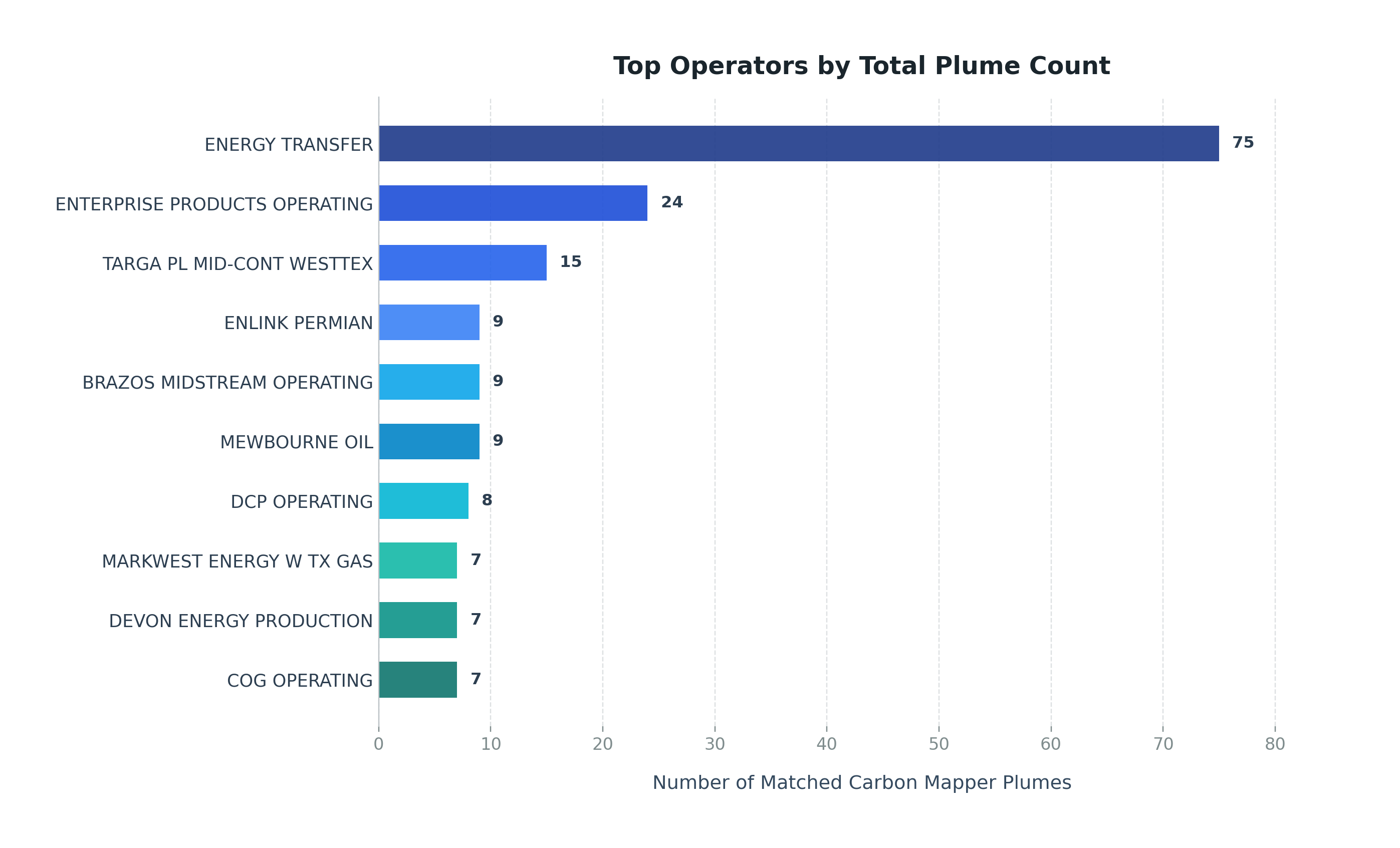
How we created this figure: For each of the 1,097 plumes detected across the three basins from January 1, 2025, to June 1, 2026, we assigned a potentially responsible operator if and only if we had evidence of a single operator located within 100 meters of the plume, automatically matching plumes to operators using a series of publicly available data sets.
We note a few additional facts about the full set of sources at which methane plumes were detected during the study period, across the three basins. In total, there are 177 sources at which 2 or more plumes were detected by the Tanager-1 satellite during the study period. Many of those sites are persistent sources of emissions: At nearly a third of those sites, emissions were detected at least 2/3 of the times those sites were observed. In all three basins, more than a quarter of those sources had a persistence rate of 67% or higher.
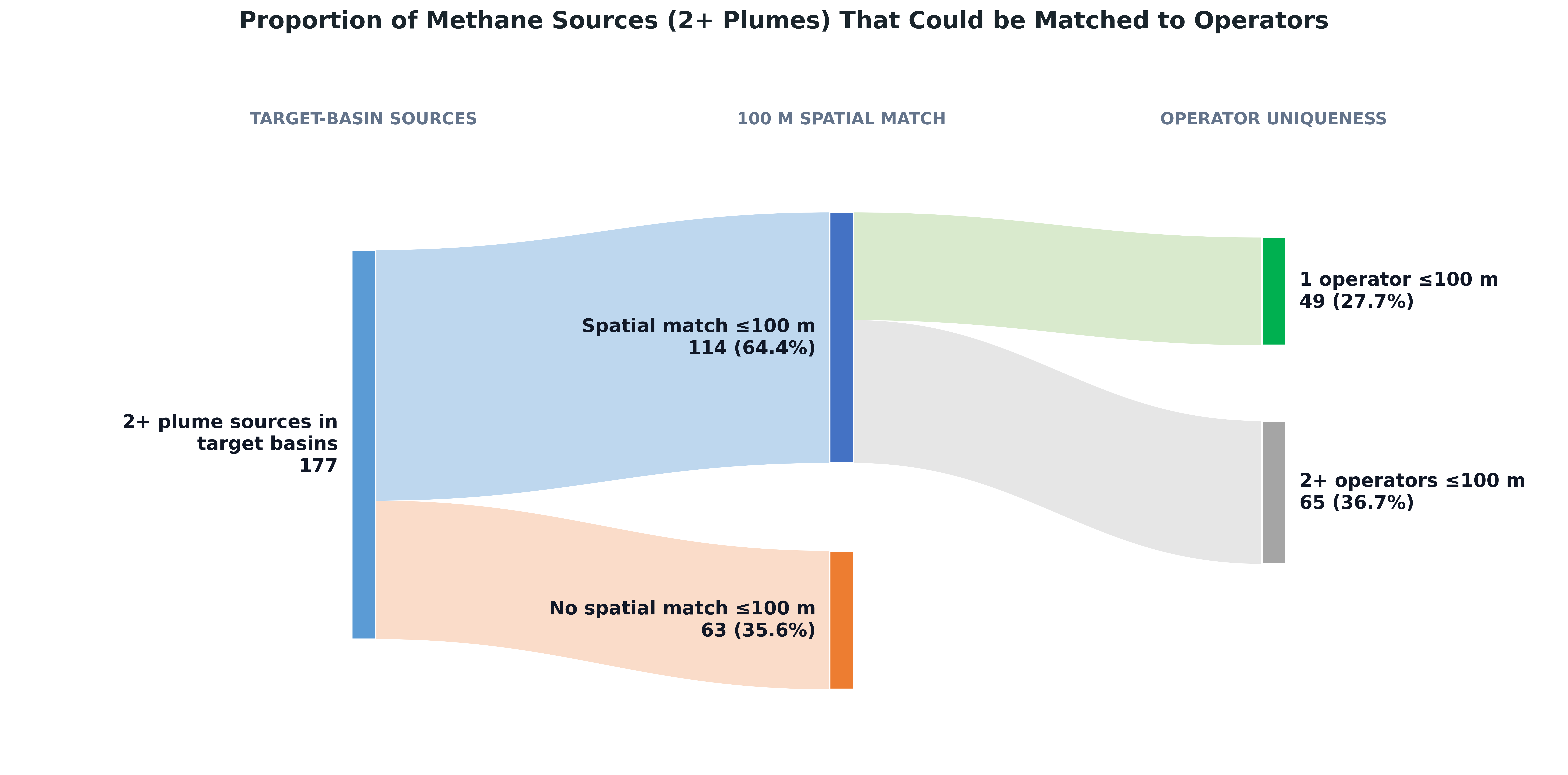
Finally, we note that significant data gaps in owner/operator information and health impact data remain. Fewer than a third of the sources in the dataset could be matched with good confidence to potentially responsible owners using publicly available data—and because we rely on datasets that are incomplete and imperfect, even those matches are susceptible to inaccuracies, as noted in our methodology. And for many plumes and sources in the dataset, information is not yet available on the community-level public health impacts of detected plumes. Additional transparency on these issues may advance mitigation efforts.
For a full explanation of how this type of satellite data is collected and analyzed, see our earlier report on Top 25 plumes from the oil & gas sector globally. As always, we welcome feedback on our methodology or if anything about our lists does not look correct. You can reach us here.
Top Photo by Wolfgang Weiser on Unsplash.
-
J.D Environmental Law